Cumulative flow and statistical process control for delivery
The chart nobody reads until something goes wrong
If you have worked on a software team that takes delivery seriously, you have probably seen a cumulative flow diagram in a presentation at some point. A colorful stacked area chart, different bands for each state on the board, growing to the right as time passes. Someone pulls it out during a retrospective, points to where a band gets thick, and says "see, this is where we had a bottleneck in March."
That is a useful post-mortem. It is less useful when the band is widening right now and nobody notices until a milestone is already late.
The promise of CFDs and statistical process control is genuine: they can tell you whether your delivery process is stable, whether the variance you see is just noise, and whether a slowdown is a real signal worth acting on. The problem is that most teams do not have the time or tooling to build and maintain these charts continuously. They get generated once a quarter, analyzed by one person who read a Kanban book, and then forgotten.
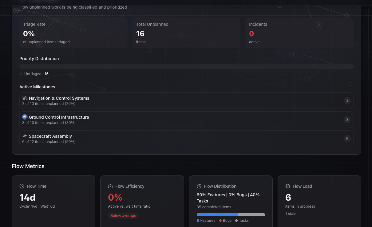
GoalPath includes a cumulative flow diagram on the velocity analytics page with four bands (Not Started, Started, Finished, Accepted) over time, with daily or weekly granularity and milestone filtering. But the chart is only one layer. GoalPath also surfaces the same underlying data as structured diagnostics: WIP levels, flow time trends, aging work, and velocity variance. The chart shows you the shape. The diagnostics tell you what to do about it.
What a CFD is actually telling you
A cumulative flow diagram plots the number of work items in each state over time. The bands stack on top of each other. The bottom band is typically done items, growing steadily upward if work is actually finishing. The middle bands are your in-progress states. The top band is your backlog.
Three things are visible at a glance when a CFD is healthy:
Band width tells you work-in-progress at each stage. If the "In Review" band is thin and consistent, reviews are flowing. If it keeps getting thicker, work is queuing at review faster than it is being cleared.
Band slope tells you throughput. The slope of the topmost line of your "Done" band is your delivery rate. Steep slope means work is shipping. Flat line means it stopped.
Vertical distance between lines tells you cycle time. The gap between when work enters a state and when it exits is visible as vertical height on the chart. If that gap grows, items are spending longer in each stage.
The patterns you are looking for are divergence (bands widening unpredictably), stagnation (the done line going flat), and compression (bands narrowing, meaning one stage is starved of input). All three have different causes and different fixes.
The signal-vs-noise question
Statistical process control, which is the manufacturing discipline this analysis comes from, was developed by Walter Shewhart at Bell Labs in the 1920s. His insight was simple: some variation in a process is just noise, random fluctuation that you should not act on. Other variation is signal, something in the system actually changed, and you should find out what.
The way you tell them apart is control limits. You calculate the average of your process metric and the standard deviation. Anything within roughly three standard deviations of average is probably noise. Anything outside those limits is worth investigating.
For software delivery, the equivalent question is: when your velocity drops one week, is that a real signal to be concerned about? Or is it just normal fluctuation in a complex system?
Most teams never answer this rigorously. They see a slow week and either panic and add meetings, or dismiss it and miss a real problem developing. The answer depends on how much variance is normal for your team, which requires measuring variance over time, not just looking at last week.
Where teams actually get stuck
The practical failure mode is not that teams lack CFDs. It is that the data they need to diagnose problems lives spread across different places: the board shows current WIP, a spreadsheet tracks velocity, someone's notes have the context for why February was slow.
The "where are we?" sync exists precisely because this information is not connected in one place. You need a meeting to assemble the picture that the data already contains.
The ritual it spawns: a weekly or bi-weekly delivery review where someone manually aggregates the board state, eyeballs recent velocity, notes which items have been sitting a long time, and reports to leadership. This takes an hour of preparation and thirty minutes of meeting time. And it is still usually imprecise.

How GoalPath approaches this
GoalPath gives you the CFD itself, and then goes further. The chart is there when you want the visual. The diagnostics below surface the same signals without requiring you to interpret bands on a graph.
Flow load aging shows you which items in progress have been there the longest. In a CFD, an aging item shows up as a band that stays wide. In GoalPath, it shows up as an item flagged by how many days since it was started. You do not need to spot the pattern in a chart. The aging is surfaced directly against each item. Items that have been sitting too long are visible in the flow load view without building anything.
Flow time trends track how long items are taking from start to finish over recent weeks. This is the equivalent of watching your cycle time on a CFD. If the trend is climbing, something in the process has changed. If it is stable, your process is in control in the SPC sense: it is predictable, even if not fast.
Velocity variance and standard deviation are how GoalPath models forecast uncertainty. Rather than giving you a single-point estimate for when a milestone will finish, GoalPath uses the actual variance in your team's velocity to widen or tighten the forecast range. High variance equals wider range. Consistent delivery equals tighter range. This is statistical process control applied directly to your forecasts. The team with a standard deviation of two points per week gets a tighter date range than the team with a standard deviation of eight, because their process is more in control.

The insight categories these map to in GoalPath Insights are "Predictability & Forecasting" and "Flow & WIP", which is not a coincidence. Those are the same two questions a CFD answers.
When variance is signal vs noise in practice
Here is the practical heuristic. If your velocity drops one week and then recovers without any change in the process, that is probably noise. If it drops and stays low, or drops in a way that correlates with a change you can name (a new engineer joined, a large unestimated item landed, a dependency got blocked), that is signal.
GoalPath's forecast range already accounts for your historical variance. If a slowdown stays within the range that the standard deviation predicts, you probably do not need to react. If your current pace is pushing the expected delivery date out beyond the pessimistic scenario, something real has changed and you need to find it.
The meeting that this replaces is the delivery review where someone says "we had a slow week, should we be worried?" GoalPath answers that question with data: here is how this week compares to your normal variance. Is this week outside your control limits? The mechanism is the structured execution data GoalPath collects as teams do their work, used to generate a forecast range grounded in how this team actually delivers, not a generic assumption.
What to check if your flow looks unstable
If you are seeing high variance in GoalPath's forecasts, or if the flow load aging shows multiple items sitting in the same state for a long time, the diagnosis usually points to one of three places:
WIP is too high. Items enter faster than they exit. The CFD equivalent is bands widening. In GoalPath, this shows up as a long aging list with items across multiple milestones. The fix is to stop starting and start finishing.
A stage is blocked. One particular state accumulates items while others flow normally. In a CFD this is a specific band that widens while others stay thin. In GoalPath you can see this in the breakdown of where aged items are sitting. If they are all queued at the same point, that is your bottleneck.
Estimation variance is high. Items marked as "small" take wildly different amounts of time to finish. This inflates velocity variance without telling you anything useful about the process. The fix is not to estimate more precisely. It is to make items more consistently sized.

The honest answer about CFDs
Teams that use CFDs religiously are doing something valuable. Having a visual representation of flow over time makes patterns visible that raw numbers hide.
GoalPath now gives you that visual: a stacked area chart on the velocity analytics page showing item counts per status over time. You can toggle between weekly and daily granularity, filter by milestone, and see exactly where bands widen or the done line goes flat.
But the chart alone is not the point. The questions a CFD answers (is my WIP growing, is my cycle time stable, am I delivering at a consistent rate) are also answered by the flow metrics, forecast variance, and aging views built into GoalPath. You get the chart when you want the pattern. You get the diagnostics when you want the action.
For most teams, the bottleneck was never the absence of a CFD. It was that the relevant data did not surface in the normal workflow until someone had already called a meeting about it. GoalPath puts it in the workflow (the chart, the metrics, and the coaching) so you see it before the meeting gets called.
Further reading
- What Is the Cumulative Flow Diagram? (Businessmap): a solid primer on reading CFDs, including the bottleneck and stagnation patterns
- Aging Work in Kanban (Nave): how work item age connects to cycle time and forecast accuracy
- SPC for DevOps (Airacad): applying statistical control charts to software delivery metrics
- 4 Key Flow Metrics (Scrum.org): the canonical flow metrics framework: WIP, cycle time, throughput, and work item age
Ready to plan your roadmap with data?
Create an account on GoalPath and start tracking velocity, forecasting milestones, and delivering predictably.
Create an Account